Welcome to the second issue of HEX News, an infrequent newsletter from HEX Projects (the typographic company of Nick Sherman).
HEX launched 7 years ago, on Halloween 2018. To celebrate, I just released a preliminary version of an experimental typeface I started working on even before then. More on that below.
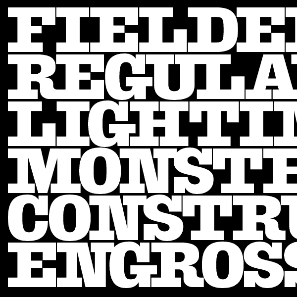
The typeface in the header is HEX Franklin X Condensed Ultra.
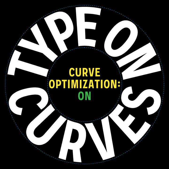
New fonts: Shop Sans
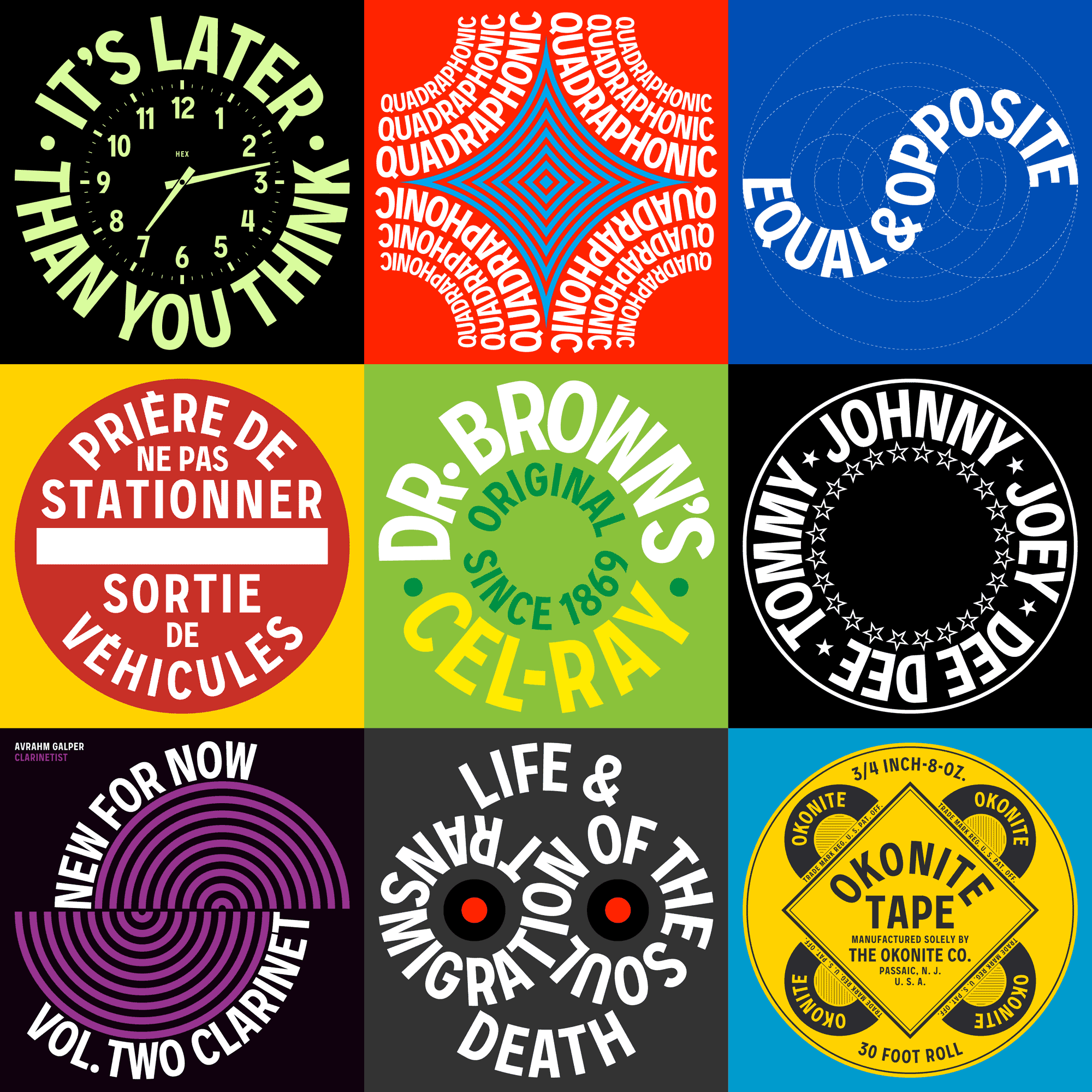
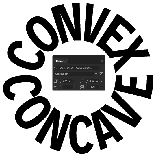
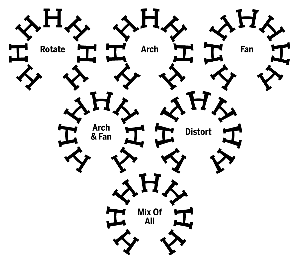
Shop Sans is a typeface for setting text on circles and curved baselines. Its ‘Curve’ variable font allows for bending type smoothly along arched paths, with adjustable curvature.
The design is largely inspired by examples of curved lettering I’ve been documenting for almost 20 years, and the related Text on a Curve photo group I administer, which just turned 10 years old last week. I started that photo group after working on experiments that would eventually lead to Shop Sans:
In 2015, my “Variable Fonts for Responsive Design” article advocated for a variable font format that still didn’t exist yet. The article gave examples of real-world problems that could be addressed with a flexible new font format. My final example, which I had forgotten about until last week, jokingly suggested:
Adjusting glyphs set on a circle according to the curvature of the baseline. (Okay, maybe that’s pushing it, but why should manhole covers and beer coasters have all the fun?)
Almost 11 years later, with that variable font format having since become a reality – and with help from tools like Ryan Bugden’s Architect – it’s satisfying to release a font that does exactly the thing I joked about as being far-fetched before. You might say it’s all come … full circle.
A preliminary version of Shop Sans is now available from Future Fonts, with expansions and improvements coming soon. Subsequent updates are free for existing license holders, so get it now while the price is still low.
Get the fonts at Future Fonts →Other Notes
Lauweriks in use
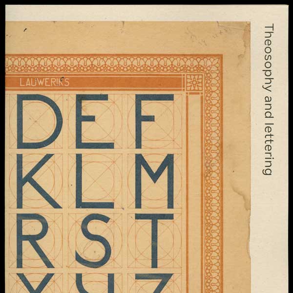
Sander Pinkse used a pre-release version of my Lauweriks typeface for a small booklet edition of Mathieu Lommen’s article on the ‘Letterboek’ that inspired the typeface.
More info →HEX at HyperTalks 2.0
For the HyperTalks 2.0 event organized by Future Fonts, I gave a talk about the influences that have informed the design of the HEX Franklin type family since its initial release.
Watch the video →Black Sabbath type article
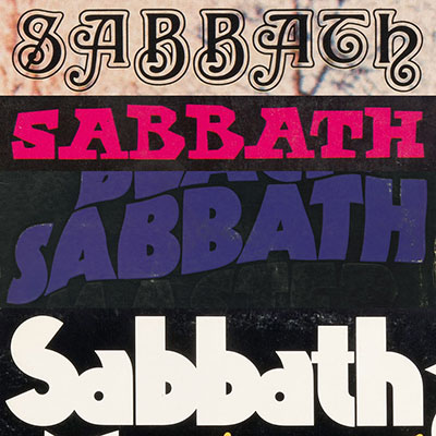
To commemorate the life of Ozzy Osbourne, I wrote an in-depth article for Fonts In Use about the obscure typefaces used for the titling on Black Sabbath’s early album covers.
Read the article →Early look: HEX Hefty
HEX Hefty is a digital interpretation of a chunky slab-serif typeface originally offered by Photo-Lettering Inc. It’s still an early work in-progress, but licensing is available by request via email.
Preview HEX Hefty →HEX × Typographics
I designed and developed the website for the Typographics design festival earlier this year at Cooper Union in New York City. HEX was also a lead sponsor of the festival.
Visit the website →HEX Franklin in use
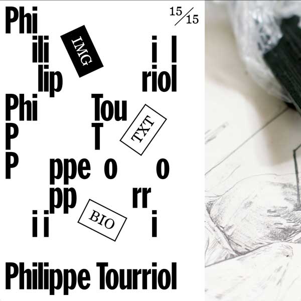
Studio WA75 used HEX Franklin web fonts for the website of artist Philippe Tourriol. HEX Franklin’s ‘Tyght’ variable font allowed compact spacing without manual kerning adjustments.
More at Fonts In Use →Miscellaneous Recommendations
Since you made it this far in the newsletter, here’s a list of things that aren’t from HEX but I appreciate and want to share anyway.
★ Katherine Small Gallery is one of my favorite booksellers, specializing in books on graphic design and typography. They also host small exhibits and events at their shop in Cambridge, Mass. Their email newsletter is great too, with some of the best typography books and driest humor. (Full disclosure: K. Small Gallery has used my fonts in the past, but I was a big fan long before that.)
★ Font of the Month Club is a subscription from DJR where you get new fonts every month. The fonts tend to be quite unique, often experimental in nature, pushing the state of the art of typographic technology. The subscription price is absurdly reasonable at $6 per month (with cheaper options for those who need it), especially because some of the releases include multi-style variable fonts, and almost every font includes extensive character support. I still can’t believe DJR manages to release such well-considered fonts every single month (!) and I always look forward to reading his thoughtful write-ups. He’s also just one of the nicest, smartest, most generous people.
★ Patsy’s Pizzeria in East Harlem is one of the OG New York coal-oven pizzerias, founded in 1933. Go to the original location in East Harlem – none of the other pizzerias in the city using the “Patsy’s” name are as good. Because it’s further uptown, there are fewer tourists and rarely a wait to be seated. Next door to the main restaurant they also offer slices at very reasonable prices ($2.50 for a plain slice last time I was there).
★ Spectacle Theater is a small collectively-run cinema in Brooklyn. Their programming features some of the best overlooked and offbeat movies you are unlikely to see anywhere else. Tickets for most shows are just $5, and the volunteers who run the theater are great people (including fellow typeface designer Ben Tuttle). I especially like their Blood Brunch surprise horror movie matinee series.
★ ProPublica is an independent, nonprofit newsroom focused on exposing corruption, informing the public about complex issues, and using investigative journalism to spur real-world changes. Unlike many media outlets, they don’t have corporate owners, advertisers, or shareholders influencing their coverage. Their reporting is freely accessible to the public, funded by donations from readers (like me).
★ 1MB Club is a collection of web pages that weigh less than 1 megabyte each. Over the years, and especially recently, websites have become bloated with unnecessarily complex code frameworks and script libraries, making the web slower, less accessible, less future-proof, worse for the environment, and generally more annoying than it should be. So it’s refreshing to see 1MB Club celebrate websites that “do the most with the least”, as my dad would say. The site has motivated me to be more proactive about making my own work more efficient: All 6 Typographics websites I’ve built since 2020 are members of the 1MB club. The newsletter you’re reading right now qualifies for membership too.